ViAspaze← Back to home

Insights

Notes from the studio

What we have learned building apps, websites and AI products for brands that want more than a launch. Three ideas we keep coming back to.

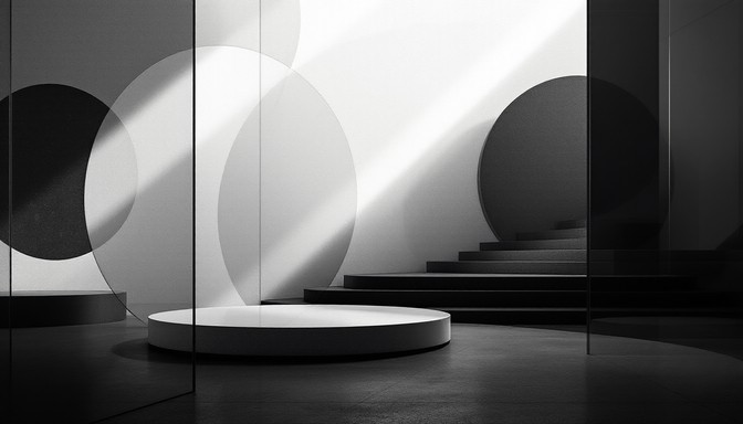
Monochrome glass and light, a quiet architectural space

01

Why the best brands feel quiet

Restraint is a design decision. The brands people trust most rarely shout, and that calm is built on purpose, one touchpoint at a time.

Loud is easy, calm is earned

Adding is the default move: another banner, another badge, another reason to click. Every addition asks for attention, and attention is the one thing your customer has the least of. A quiet brand has decided what matters and has the confidence to leave the rest out.

What quiet looks like in practice

  • One idea per screen. If a page has three jobs, it does none of them well.
  • A small, consistent palette. Colour that appears rarely carries more weight when it does.
  • Space as a material. White space tells people where to look and signals that nothing is being hidden.
  • Plain language. Short sentences, specific claims, no superlatives.
Confidence is mostly what you choose not to say.

Build it into every touchpoint

Quiet only works when it is everywhere. An elegant homepage followed by a noisy checkout email undoes the work. Audit the full path, from the first ad to the receipt, and remove anything that does not help the person in front of it.

Where to start

Pick your most visited screen and cut a third of it. Then look at what people missed, if anything. Usually nothing is missed, and what remains reads as more certain.


Blue light trails on a winding road at night

02

Designing for motion, not screens

People do not experience a product as a set of static frames. They experience the movement between them, and that is where it feels fast, clear or broken.

Think in transitions

A screen shows a state. A transition explains how you got there. When an item slides into a cart, the person learns where it went. When a panel fades in from nowhere, they have to work it out. Good motion removes questions before they are asked.

Motion principles we use

  • Purpose first. Every animation should answer one of three questions: where did that come from, where did it go, what just changed?
  • Fast and eased. Most interface motion lives between 150 and 400 milliseconds. Slower feels heavy, faster feels like a glitch.
  • Consistent physics. Elements that behave the same way should move the same way, so people learn the rules once.
  • Respect the user. Honour reduced-motion settings and never make someone wait for an animation to finish.
If you remove the animation and nothing is lost, it was decoration.

Performance is part of the design

Motion that stutters is worse than none. Animate transforms and opacity, keep the main thread free, and test on a mid-range phone rather than a developer laptop. Smoothness is felt long before it is noticed.

Where to start

Record a screen capture of your product in use and watch it at half speed. Every jump cut is a place where a transition could carry the person through.

Watercolour of balanced stacked stones

03

The case for slower launches

Shipping fast is a virtue until it means shipping something nobody can rely on. A launch is a first impression, and it only happens once.

What speed actually costs

A rushed launch rarely saves time. The bugs, the missing states and the confused first users all come back as support work, patches and apologies, usually at a worse moment than the one you skipped. Early users also set the tone: they judge the product by what they see on day one, and they tell others.

What slower looks like

  • A smaller, finished scope. Launch one thing that works end to end instead of five that almost do.
  • A real beta. Put the product in front of a handful of people who are not on your team, and watch them use it.
  • Edge cases on purpose. Empty states, errors, slow networks and first-run flows are what people meet first.
  • A plan for day two. Analytics, feedback and a release cadence ready before launch, not after.
Slow down to the point where the product is dependable, then go fast.

When to move quickly anyway

Slower does not mean never fast. If a decision is cheap to reverse, make it quickly and learn. Take the time on the ones that are hard to undo: your data model, your brand and your first impression.

Where to start

List everything in your launch scope and mark each item as essential, nice to have, or later. Ship the essentials, polished, and give the rest its own release.

Have something to build?

Tell us about the product and the people it is for. We will reply with how we would approach it.

Start a project
© 2026 ViAspazePrivacy policy · Terms of service · Back to home